
The big name on the new comics series Faithless is writer Brian Azzarello, but it’s artist and colorist Maria Llovet who has really blown readers away with her style and aesthetic choices, her sense of fashion and her use of color. Her approach has helped to define and shape the book in the way that a good artist and a good collaboration should be able to do.
Llovet has written and drawn a number of books that were published in Spain, including Eros/Psyche, Porcelain, Heartbeat and Insecto. She also drew There’s Nothing There, which was written by Patrick Kindlon and published in the U.S. Spending some time on her website and social media, it’s clear that Llovet is a busy and inventive artist with an agile mind. She was kind enough to take the time to answer a few questions by email about Faithless, another book coming out in the U.S. later this year and how she works.
Please note this interview includes preview art containing nudity that is NSFW or for kids.

Maria, I always like to start by asking people: How did you come to comics?
My parents were comic readers, so I grew up looking at Asterix and Tintin, and they took me to the Barcelona comic convention as a child, so you could say comics were always a part of my life. All the children in my generation grew up watching Dragon Ball, Dr. Slump or Ranma 1/2 on the local TV, so I think we were very fortunate. And when I was around 12, manga landed with force in Spain. That’s really when it started for me.
Before considering comics as a profession, I studied graphic design and artistic jewelry. I also considered 3D modeling and fashion design. In the end, I decided on comics. I guess because I can mix my two great passions, writing and drawing. Then I discovered the magic between the two, the “transparent” art of visual narrative.

How did you end up working on Faithless and what interested you about the project?
I was contacted by my editor, Sierra Hahn. She was preparing this project with a writer (I didn’t know who yet!) and she asked for some examples of my work. They liked what I sent them, and when they explained what Faithless was about, I was very excited to be able to work on it. The story touches many subjects I’m interested in; it felt completely right from the start.
And they wanted to do a very sexy book, which is awesome because sex and sexual tension bring something special to a story, bring it closer to the reader in my opinion, and play a big part on what I like to do in my works. That they were looking for this specifically guaranteed that there was going to be a certain vibe to the story that I would love. I feel very lucky to work on Faithless, both for the people involved (a true dream team), but also because it’s a daring and brave project.
Brian is known for leaving very light descriptions and focusing more on the dialogue. How much are the page design, and a lot of the art and design choices, yours?
I adore the way Brian’s scripts are written. Not only is the story awesome, but also how he tells it is great. That’s a curious thing, thinking this sentence is funny or clever, but it’s not going to reach the public because it’s the way he’s telling it to me and some other insiders. But it creates a mood in my brain, and I try to convey it to the page. In any case, I really appreciate when a writer gives space to the artist to take the scene the way it’s visually necessary. You’ll have to do it eventually, so it’s better if the space is given and you don’t have to struggle for it.
I’m not sure how other artists deal with this but when I get a script I try to read it without the “technical” specifications (that is the kind of shot or POV, etc). Just read what’s happening. And then I imagine how I would narrate that, and compare it with the writer’s “technical notes” and the space I have in the number of pages, etc. Sometimes the writer’s specifications coincide with what I imagined and sometimes not. If they diverge, I only follow them if there’s a real reason for doing it; if it’s something justified regarding the script or it affects how the action in particular will be perceived, etc.
Other than that I trust my own judgment. That doesn’t mean I can’t be wrong, but I have to take the lead in what I believe is my field of action, in this case the visual narrative. If the result isn’t perfect, then we’ll discuss and change it later. For me it’s always better to do it like that or there’s a real danger of leaving the visual narrative unattended. There’s nothing worse, in my opinion.
In all your work, you tend to use a lot of horizontal panels and break down the page into horizontal shapes. I wonder if you could talk a little about the comics and cinematic influence on how you think about page and panel design?
I think the use of horizontal panels started as a very early influence from my partner, Jesús Orellana. He’s a comic author and filmmaker (author of the CG short film Rosa).
We met at a comic school in Barcelona, and we’ve grown together both as people and artists. Reading something he has narrated is really like seeing a movie, and that has always been inspiring for me. We dissect every movie we see and spend hours talking about narrative and scripts and art.
I love watching films and learning through them. Cinema seems to provide with much more stimulating info and options than comics do for me, but that’s ok, because if you only take from your own source you end up in an endogamic circle. I think it’s healthy to take things from other fields that are so close to yours in a way. I also love fashion photography. For me it’s very stimulating to do research in this field. I have lots to learn from it regarding composition and color. Not everything that works on photography works on a drawing though, it’s interesting to discover the differences, too.
You’re not just drawing the line art, but coloring the book. So often in American comics, these are two different jobs, but why is color so important for how you think about and work on pages?
Did you know that actually my first ever work on comics was as a colorist? I colored two comics for Les Humanoïdes Associés with my partner Jesús Orellana, Messiah Complex 1 and 2, written by Alex de Campi and drawn by Eduardo Ocaña. This was in 2006, I think.
I’ve never wanted to just draw, or just color, or just write. I’m interested in all aspects because I’m interested in telling stories and telling them in a personal way. So for me it is natural to try and cover all aspects of what I’m doing.
It was only recently that I decided to start working as an artist and collaborating with other writers. I had the opportunity before, but for one reason or another I ended up saying no every time. I think that was because I was searching for my own style; it was important for me to know who I was and why I was doing what I was doing. Once I started to find myself I felt safer saying yes to collaborate with others because then I knew what I could bring to the exchange without fear of losing my voice in the process.
I still have a very long way to go, especially with colors, but I feel I’ve reached a point where I’ve stopped walking in circles and can finally follow a certain direction to improve.

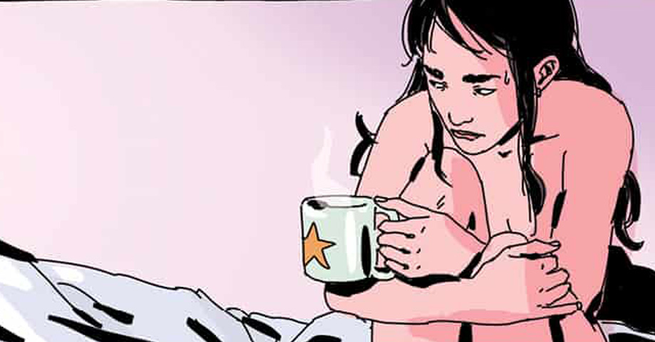
More specifically, can you talk about some of the color choices you made in the first issue of Faithless? Because you don’t use a palate that screams – or even suggests – horror.
I think the story of Faithless will be slowly building up, and so will the colors. In this first issue we’re just seeing normal scenes in a normal girl’s life. Except we readers know that’s not true.
But Faith is unaware of that. Right now, Faith’s day is just a little more colorful than a regular day because of Poppy. There’s nothing horrible in her life at the moment, even a stranger’s suicide can affect you only so much when you’re falling in love. The colors are accompanying Faith and the mood surrounding her. As that changes, the colors will too.
That being said, I really don’t think it’s necessary to have a very dark palette or very “classic horror” mood to convey the anxiety or pressure that a story like that is likely to provide. And also, is Faithless a horror book? Maybe, but it’s certainly not only that. I think the colors can play a part in telling the reader, ok, there’s horror in this story, but that’s not the only thing you’re going to find here.
After two issues, I think how you’re using color to help tell the story is more apparent. What were your conversations with Brian and Sierra about the color scheme for the book like?
We didn’t really talk about it, it just happened that way because that was what felt right. It’s easy to rationalize it now but I really go with my gut. We discuss later and if there’s something that can be changed or improved we do it. I really like some things in issue two that come from this kind of afterward changes. The scene of the party for example. I first did it in purples and they asked me to change it to make it more different from Poppy’s place. As I had done the fire escape scene in reds, I thought it would be a great contrast to try green on the party. It really improved the overall scene. Every single note from Brian and Sierra makes the thing better.
Besides the sense of style and design, you also have a great feel for fashion. I wonder if you could talk a little about fashion and using it to help build character.
I love fashion in every aspect, the clothing design, the stylist approach of mixing and matching clothes, and also fashion photography and aesthetics as I was telling you before. So I’m really drawn to this world in general. I very often do sketches of fashion clothes or models, just because I take great joy in doing it. I’d love to collaborate with clothing brands or work as a fashion illustrator sometime.
Since I have this passion, I try to infuse it to my work and it’s great because I can do a bit of all of them in my comics. Clothing can say so much in a drawing. It says things about us in real life, of course, but in a comic it is a real part of the character because of all the info that we can extract from the way a character is dressed or moves in a certain clothes. It’s a bit like a caricature of the personality, sometimes through clichés but sometimes in a more subtle way. The character descriptions of Poppy and Faith included a general idea of the kind of clothes they would wear, and they were focused in a direction that I particularly liked very much, so I built from there.
Faithless is introducing you to new readers, but the only other American book of yours is There’s Nothing There, which was written by Patrick Kindlon, but you’ve also both written and drawn a number of comics yourself. How does your process change when you’re drawing your own script vs working with a writer?
It changes in every possible way. I really think being an author or working in collaboration with other writers are two completely different jobs. They share many obvious similarities, and one can enjoy both, but they’re fundamentally different at their core.
Who is the author of a certain work? Who thought it? Who brought it from disconnected ideas to a fully developed story? I’m not saying the artist doesn’t have an important part to play. On the contrary, the way the story is translated into images through the storyboard and the visual style of each particular artist will flesh the comic out into what it is. But the direction the characters are following or the fates that await them will never be his or her responsibility. That’s what the writer is here for.
We can kid ourselves all we want, but the author of the work is the writer. Even in the cases when we like that particular work just because of the art or narrative, the author is still the writer. I’m being very categorical, right? Maybe I won’t agree with myself if you ask me tomorrow. [laughs]
The main difference for me is that if I write the script, I generally have already seen in my head more or less what I want to do. Sometimes the scenes play in my head like a movie, with all the elements of tempo, silences and dialogues. When this happens, I write it down in detail, on rare occasions I even do a temporary storyboard for a certain scene, but this is not usual, with notes is normally enough. Other times I just write it normally and have only a general idea of what I’ll do on storyboard step.
The crucial moment of translating words into images is the most important and most different aspect. When you “move” your own characters you already know them, know them inside, every aspect of the story is linked in your head and it makes it easier. It’s my favorite part. Once you complete the storyboard the comic is done. When you are working with another writer you need to understand the script and the characters and make them yours in a way, to be able to make the process work in a convincing way. That’s always more difficult, but it’s also very rewarding.

On your website you write “Sex and death are the big two central themes in her work.” Which made me laugh but my next thought was, “What are the other themes worth making art about?”
Yeah, right? [laughs] The thing is it took me a while to realize I was following a certain pattern in my work. Sometimes you’re the last person to see yourself clearly, or rather, the author is the last person you should ask about the art he or she is doing because we are too involved!
So after a long time I saw clearly a pattern in my work; of sex and attraction and romance and desire, mixed with certain violence, real and metaphorical death, decadence and a fascination with blood and immortality (both of the concept itself and also extrapolated to other subjects like love for example). That mixed up with fashion and BDSM aesthetics and you pretty much have a description of what I like doing in my works.
I actually wrote this down on a post-it and look at it sometimes, because I tend to forget my own conclusions.
It was announced that Black Mask is publishing your graphic novel Loud this year. Do you want to say a little about the book?
Yes, I don’t know the exact date when it will be out, but I’m so excited about it!
I warn you, it’s a very weird work, it has all the above mentioned, but not in the way I usually develop my stories. I wanted to do something fresher, something more loose and wild in a way. Loud is a mosaic of interrelated characters and stories, all happening in one night at a club. It has almost no dialogue and that was so much fun to do, to explain so many stories in one without words.
Narrating with only visual storytelling is something awesome, and I always include scenes with no text in them, they let you feel and experience what the characters are feeling more deeply. Without intromission of words, the feeling gets directly to you without intellectual reasoning, and I love that. It requires a certain mood, of course, not every scene can work like that. But I’ve never done it so radically before. On the other hand, my stories tend to be very moody and Loud is not; it’s sordid but festive. So I guess the silence works differently here than in the more melancholic stories. Actually you can argue there’s no silence at all, the loud music in the club is present through onomatopoeias in almost every panel. I’m honestly curious to see what people thinks about it when they read it.

You’ve posted some bruja drawings on Twitter, you have a couple unfinished projects on your website. What are you interested in doing next or what are you thinking about?
Yes, the Bruja project is a compilation of illustrations about witches and occult themes I started doing some months ago. I think about it as a side project while I work on Faithless. It is proving difficult to work on it because when I have time there are other things I want to draw, too. Time management is complicated.
The unfinished stories on my site are likely never going to be really developed, but the pages you can see in my website were done at a transitional moment in which I was developing my current style, so I wanted to share them.
Right now, I have some different projects I want to explore after Faithless but I have so much work I don’t have much space to decide on which of my ideas I want to settle on, let alone writing anything. Some of these projects are more developed than others but many times a new idea overrides the other ones and becomes the new “current” project. So we’ll see, it’s too early to say.
Faithless is described on the cover as “an erotic depiction of faith, sex, and the devil in the tradition of the Divine Comedy.” I asked Brian what the Divine Comedy meant to him and he refused to answer, saying he wanted people to read the book, but I wonder if you can talk about what it means to you.
I think it’s natural to have Dante in consideration when creating something that approaches the kind of subjects Faithless does. His depiction of hell might be the most interesting piece of Western literature in human history. Its impact in our culture is undeniable. One of those rare examples that resonates through the ages and still influences artists and creators all over the world today. And it’s partly because of that influence that the work lives on and on. Take, for instance, the wonderful engravings of Gustave Doré for the Divine Comedy that are absolute masterpieces, and that inspire many others in turn. That’s how all art works, of course. The wheel never stops.