

From The Cavalier Mr. Thompson to Clover Honey, from 8 1/2 Ghosts to Dark Corridor, Viking’s End to She Wolf, to the Eisner Award-winning Satchel Paige: Striking Out Jim Crow, Rich Tommaso doesn’t just jump from one genre to another, but plays with tone and approach, style and color, and the result is an expansive body of work.
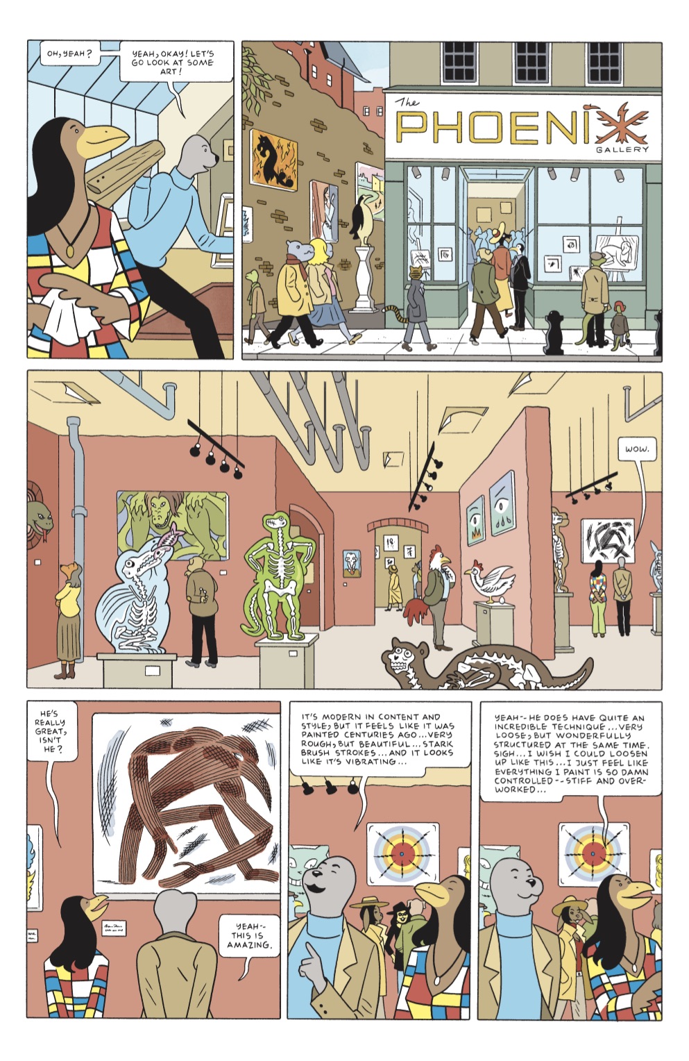
Spy Seal is a different book for him, but in truth, almost every comic he’s done has been a departure in some way. It’s an all-ages story about a spy who is, well, a seal. Set in the 1960s in a world populated by anthropomorphic animals, it owes a lot to Tintin and any number of cartoons. It’s a very different book than I admit to being used to from Tommaso but I was charmed by its inventiveness and world building – not to mention the fact that Tommaso is clearly having a lot of fun. Image just announced that Tommaso will be returning to his crime fiction roots early next year with Dry County, before returning with another Spy Seal series in the fall. With the collection, Spy Seal: The Corten-Steel Phoenix out next month and Tommaso was kind enough to answer a few questions about how he works.

Aesthetically and tonally, Spy Seal is a different kind of project for you. But that’s true of most of the work you’ve made in your career. What makes you interested in telling so many different kinds of stories?
Whenever I approach a genre, horror, crime, espionage, adventure, what have you–I always intend to do something classic in those genres, but for some reason, my brain seems to mostly pop out something strange, backwards, un-traditional instead. These strange ideas spring board me into the work, but afterwards I come away wishing I’d done something more traditional. Spy Seal is the exception though. I believe I delivered a spy story in the classic tradition this time around.
This is the third series you’ve done at Image. I’m curious, do you think your work reads better as individual issues or as a collection?
I think they work well in both forms – as a 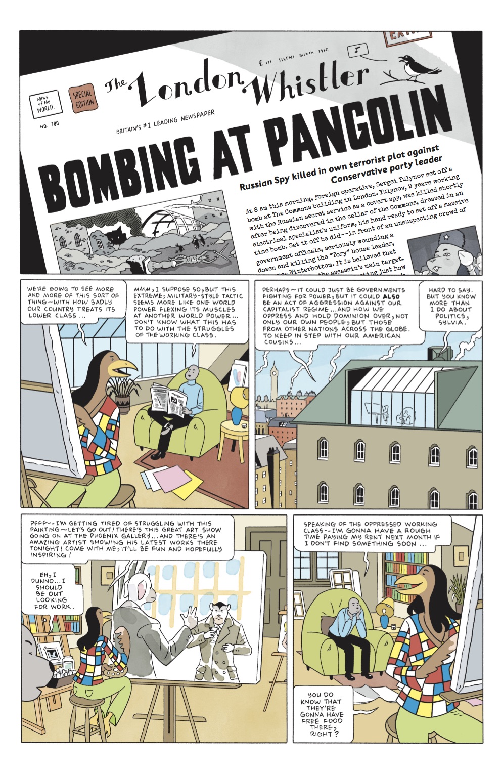 writer, I strictly prefer doing them as single issues first time out. It really helps to chapter my stories appropriately – that is, the 20-24 page count keeps me from meandering too far away from the main plot of the story. Spy Seal was a bit of a challenge, in that, I wanted to make sure it really flowed as one big story without pause or chapter cuts. So, I would open and close each issue with the characters traveling to a new place each issue. That way, I could give each issue – and the larger story – a nice, slow transition from one place to another in the story. Hopefully it makes for a smoother reading experience when it goes to trade form.
One reason I ask is because since Cavalier Mr. Thompson came out you’ve been moving away from graphic novels and you’ve been focused on serializing stories first at Recoil and then at Image. Is that fair? Is there a reason for that?
Cavalier is the perfect example of my meandering away from the main focus of the story–long sequences of character study that almost end up taking more space than the actual plot points or more vital scenes of the story. This is why I was so excited to be published by Image. I knew – from working for two years on a bunch of periodical comics that I was self publishing – that I would be able to use each issue’s page limits to focus on what was really important for my stories – what needed to be included and what to edit out.
 How do you typically work? Do you typically script everything out in some detail?
I usually see most of the story, beginning, something in the middle, and the end in my head. I write extensive notes and then start scripting the story out. I normally have to script the first issue (and sometimes all issues) at least two times. Often the second script barely resembles the first draft at all. I then thumbnail the first issue–also twice, the first pass tends to be too simplistic, a matter of just fitting the story into the allotted page count, and then I’ll go back and try to thumbnail more interesting page layouts based on the first ones. After that, I can then begin work on the actual pages. I do this one issue at a time, to break up the monotony of doing any one task for too long a time.
Does that process vary much from one project to another? I mean something like Spy Seal is more plot-driven than say She Wolf.
Spy Seal is definitely more plot driven than something like She Wolf. She Wolf – Volume 1 especially – is a story that starts out with me having something much more personal to say. Spy Seal is more of a straight-forward traditionally told genre story.
In Spy Seal you have a realistic backdrop and approach in some ways, but populated with anthropomorphic animals and I wonder abou t the choices you make given that. Does that mean the backgrounds and the details need to be more realistic and detailed to ground the fantastic elements?
Spy Seal was a comic book that I created as a 13 year old kid. In the early 2000s I revisited the character in my sketchbook and tried to make the seal a human spy who always wore a wet suit. I was just playing around, but it seemed silly to try to make this cartoon spy seal into something realistic. So, when I came back to the original anthropomorphic character, it made sense that I should just leave him as a cartoon animal and not think about the fact too much. It made more sense to keep the comic in spirit and design exactly as I had initially created it back in 1984.
I think you use color in really interesting ways, and more effectively than most, and I wonder if you could talk a little about getting the right palate for Spy Seal.
A lot of the colors are similar to my first two books at Image, but I kept a sharp eye on my collection of Tintin books for Spy Seal. Also, I have a habit of using very strong, bold colors when I initially color a page, so this time around I just let myself color the comic as I naturally was inclined to do, but when they were completed, I would lighten all the colors in the levels adjustments to 50%. This muted all of my bold colors and really captured the look of the European style of full-color comics.
Y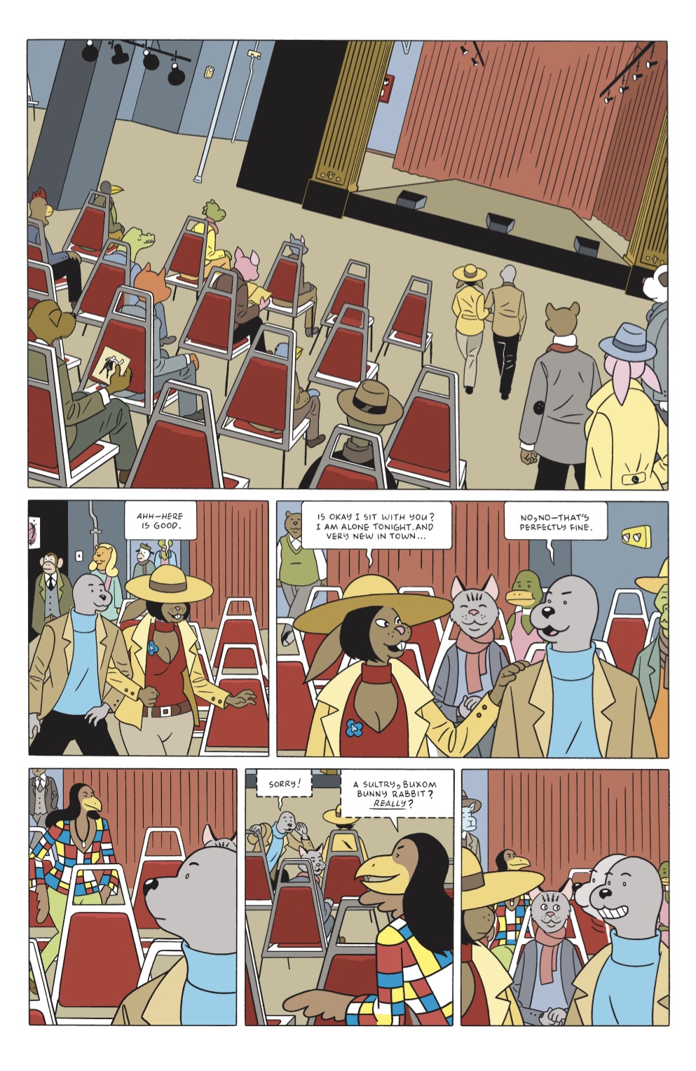 ou’re also working for Fantagraphics right now, recoloring the Carl Barks books and I wonder how that palate, which was for this all ages mid-century comic, affected how you thought about and approached Spy Seal?
My coloring on Barks’ Donald Duck is most likely where my habit of using bold colors came from, no doubt. This is why i just allow myself to color boldly and later adjust those colors to where I really want them to be. Maybe after a time, my eye will change as to what I naturally use when coloring a book. Either way, the Levels adjustment system works just fine.
I have to ask, will we see more Sam Hill soon?
Not sure. I have so many things going on right now and I do want to focus most of my time to work on more Spy Seal books. I would like to do more with Sam Hill though. It’s funny, because I can picture a very extensive library of books for Spy Seal – I can see taking him from the 60s into the 80s or possibly 1990s–yet, that was my plan for Sam Hill many years ago. I think I’d sketched out about a dozen Sam Hill books in 2009, spanning from the 1920s into the 1970s nearing his death. But, I can only do ONE long run of comics at this stage in my life. Right now, it looks like Spy Seal will be the most likely character to gain a library of books.
I have to ask, why is the seal wearing a turtleneck?
I just think it’s the perfect outfit for a 1960s spy–especially one who used to be in the Navy.