
Jordan Crane is the Ignatz Award-winning cartoonist and designer behind comics like The Last Lonely Saturday and The Clouds Above. He was the editor and publisher of the anthology NON. In recent years he’s been making the series Uptight.
His new book is something of a departure for him. We Are All Me was just released by Toon Books, and it’s a picture book, but it’s also a design project. It’s an abstract visual poem that tries to express this idea of the interdependence and interconnectedness of all things. It is beautifully designed, thoughtful, and moving. I was thrilled to talk with Crane about the book and his other comics projects.
I liked We Are All Me, but to be honest, I’m not entirely sure what to make of it.
[laughs]
 I hope you’re laughing because you’ve heard some variation on that before.
I get it. I totally get it. The main idea expressed in the book is in one sense universal and in the other sense very personal. I was trying to thread the needle – attempting to be very straightforward and simple, but then letting the reader take it the rest of the way for themselves.
 In the book’s “about the author” page, you credit your wife with giving you the idea for the book when she suggested “interdependence day” around July 4th. It’s one thing to have that idea, but how do you go from that to make a book. What was the process like?
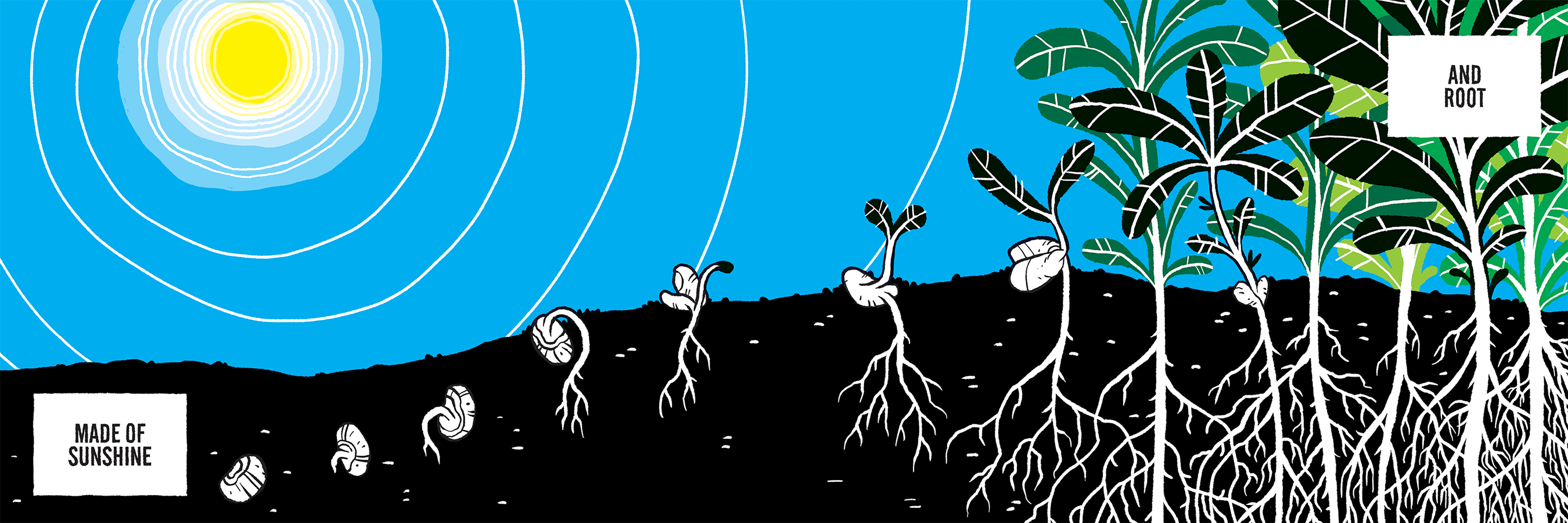
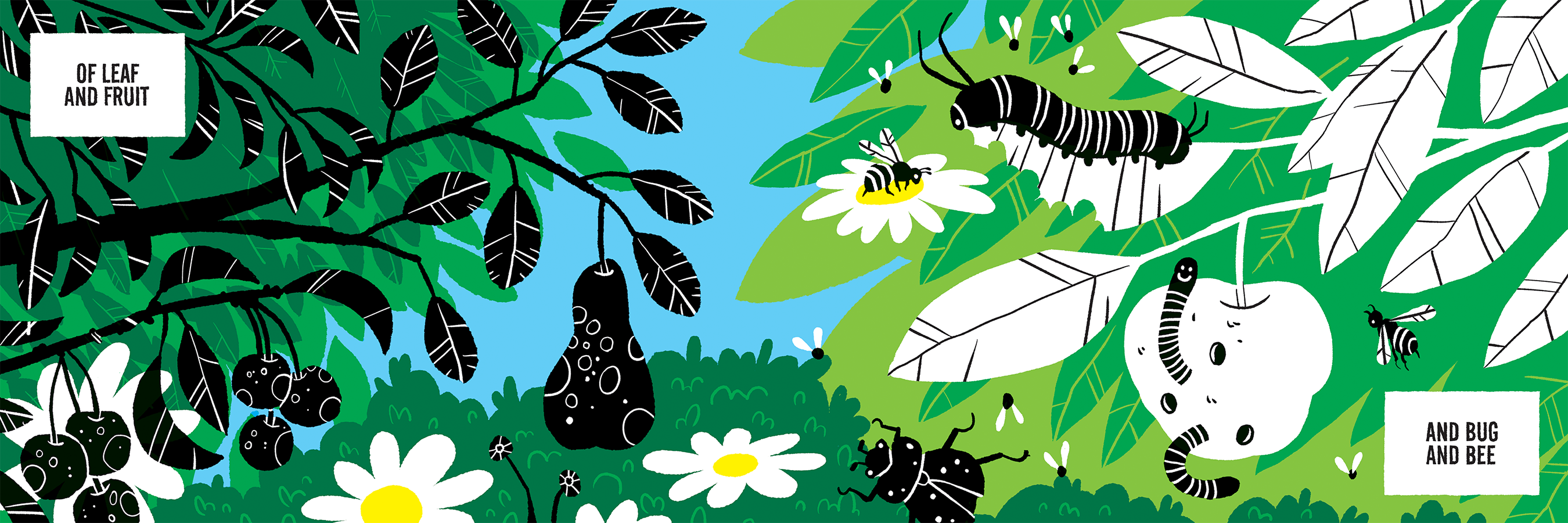
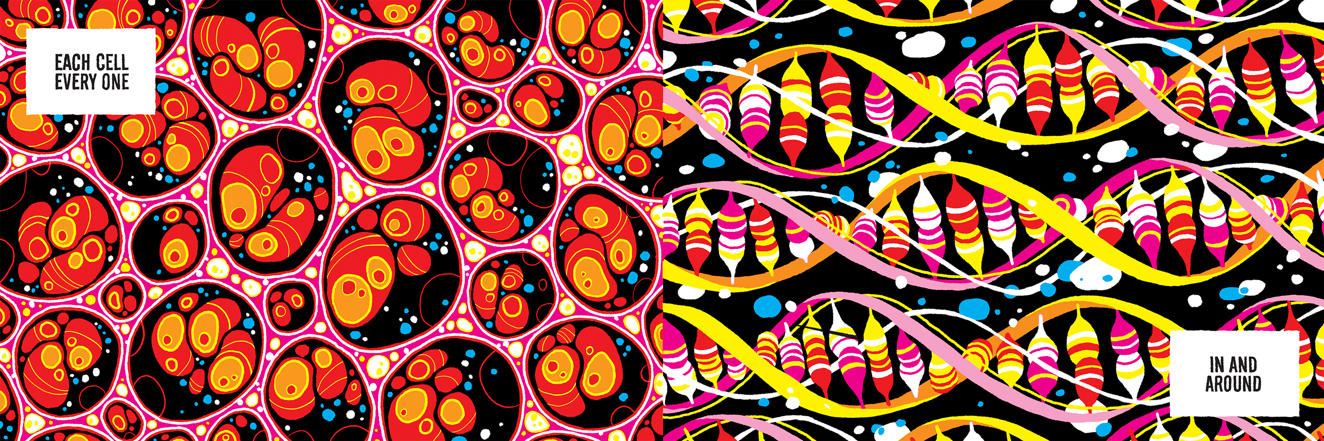
The idea of interconnectedness is, of course, a common thread of popular thought and spiritual practice throughout the ages. The first time I heard of the concept was through science, the idea that if you trace life back millions and millions of years our cells literally came out the Earth and assembled themselves into plants and animals and eventually into the people we are now. Carl Sagan talked about the interconnectedness of, not just beings on Earth, but the whole cosmos. I really liked the idea as Sagan presented it, and as I learned more about it through the years, it grew inside me, and I slowly gained a deeper understanding.
However, it was the term “interdependence” that really brought it home for me, specifically in contrast to “independence.” In America, there is emphasis on the importance of being independent, both individually and as a country. However, no one person or thing is truly independent – all the people, and materials, and life that exists around us are necessary to sustain our own lives. As I dwelt on the idea of interdependence, I found it very comforting. It created this feeling of absolute connection, that I was part of a greater whole.
The book itself started with the image on the cover. My friend Charlie’s birthday happens to be on the 5th of July, and he and I have had many discussions about interdependence. So, it’s perfect opportunity to declare an Interdependence Day. For his birthday, I thought that I’d make him an Interdependence Day flag and write him a little Declaration of Interdependence. I really struggled with how the flag would look, I started with stripes and intertwining them somehow. Nothing really took until, one day, after looking at a drawing that my daughter had made, I hit on the idea of overlapping circles of color, which would then create different colors, and it would all fit together in a repeating pattern. Charlie a big proponent of circles and how everything works in circles – life and the earth, plants and weather, growth and thoughts and ideas. In my mind I heard a loud ‘click.’ I made this flag for his birthday and it was only after that that I found I wanted to do something further with it.
It took many months to come up with the initial structure for the book. I didn’t set out to make it a children’s book, I wrote it as a comic trying to be as clear and simple as possible. For me that meant using pictures and very few words as a handrail to find your way through the pictures. I first made it as a little tiny 2×3 inch black and white mini comic, packaged along with a sewn patch that had the flag design on it. I gave that to friends and stapled it to telephone poles, just wanting to put it out into the world. The comic still didn’t quite feel right though. I had to rework the story a few times after that original version until I thought it expressed the idea in a very clean and pure way. Specifically, I wanted the story to not assume anything of the person reading it, for it to be a simple and truthful statement. When I finished that second version of the mini-comic, I sent one to Françoise Mouly.
I sent it to Françoise for a couple reasons. First of all, after finishing the black and white version, I thought that it would look amazing in color, and I really wanted to see what it would look like. Secondly, I wondered, how does this story go into the world? It’s form is more or less that of a picture book, so It made a lot of sense to work with a children’s book publisher. But it feels very different from a more traditional, narratively driven children’s book. I knew if somebody was going to get it, she would. Fortunately she liked it and she was very much behind it from the beginning. As I started to adapt the mini-comic into a picture book, I thought the coloring part would be easy. I figured it would be a very simple bold color palette – and that’s how it worked out – but the thing I didn’t realize when I was started was that introducing color meant that color became an integral part of the storytelling, because color carries its own meaning as well. When one thing is green, then that green carries similar meaning elsewhere in the book as well. Because the story is so simple, everything in it has weight in terms of information. Really seeing how it all fit together, the words, the drawings and the color, took quite a while to figure out. I had to explore how the colors fit together in terms of a whole, and I was very happy with how it finally turned out. I think the color resonates deeply with the story.
 How did making We Are All Me compare to how you work on a comic like Uptight or others you’ve made?
This is the comic that made me realize my process is very iterative. Because I was drawing it so small – 2” by 3” – I was printing out the pages and taping them together so I could see the full story, just to be in the presence of the story as a whole instead of just focusing on a single page. I would sit down and work on a page, tape it up, work on another page, tape it up. As I said, each color carries this weight of information, and the same is true of the lines. All the individual lines had to make sense and work together. By being able to look at the whole book at once, I could easily tell when a page was overdrawn, or when a page had lines on it that were just too tiny or incongruously shaped.
Usually the stories in Uptight take two drafts. I make the first version and then make a minicomic of that and a month or two later I’ll revise it and then that will go into Uptight as the final version. With this book it took many many more iterations and just a longer gestation period. That was the main difference in the process between this and my other comics. This went through a longer and slower distillation.
 Was some of that just the form itself? The book is a series of images with just a few words to guide us through.
Because the idea is so simple it had to go through a series of finer and finer mesh screens, if you will, as the idea distilled and clarified. The lines and the colors had to slowly become the simplest, clearest version of what they could be. However, the iteration process continues. I look at the book today and see things that I could change. Like between the rain page and the sunshine page, I should have put a rainbow. Why didn’t I put a rainbow? [laughs] To the point where I’m like, maybe I can talk to Françoise about making some changes if we do a second printing… [laughs] So maybe the iterations aren’t done, but they probably ought to be.
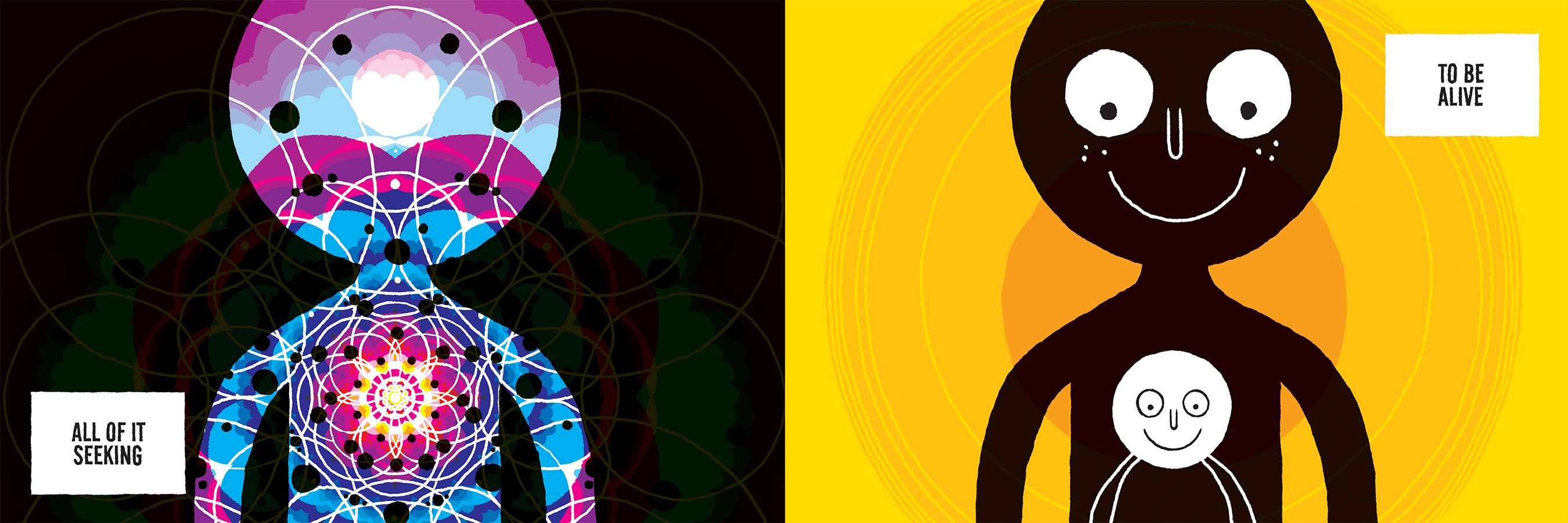
 One choice I wanted to ask about is the opening. “I am one” and accompanying that text you have this circle with a face and two limbs centered in a human body, which is the image of the soul. Or at least that’s how I took it.
That’s one way of seeing it.
Why did you begin there, with that image?
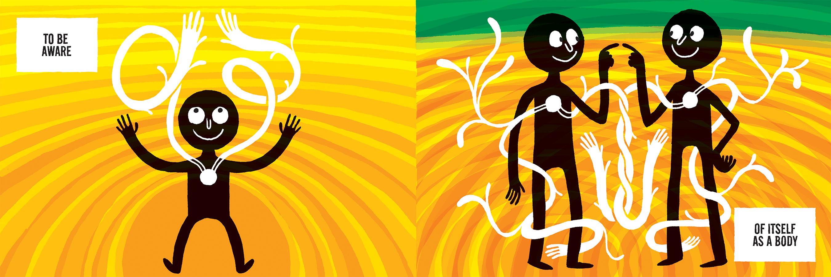
So, it’s this interior spark of life, the notion of the individual self that defines a lot of our experience of the world. Then I realized, that’s what many people call the soul, which, I worried, could carry some baggage with it. So, that’s one way of seeing the beginning. Another reason I started there is because the book is circular. You start out with the cover and you have “We Are All Me.” Then you get to the opening line “I Am One” and you go through the whole book and you get to “We Are All One.” Close the book, and the back cover says “We.” Who are we? Well then you can flip the book over and “We are all Me.” And then “I am one,” and you can go on and on in a circle. Because I ended with “We Are All One,” I wanted to begin with “I Am One.” I liked the resonance there because it starts in what is immediately identifiable as our place of supposed independence. I am one. I am singular. And it ends in a place of connection between everything, complete interdependence. Visually, that asks to be a circle. So we start with a single circle. It’s a good place to start, at a single point, and then expand out from there.
 I’m curious, for you, what’s the relationship between cartooning and design?
This book was very much a design project in terms of clarifying and expressing an idea clearly. When I started this book, I had been very comic focused and not doing much design work. Part of the motivation when I made that flag for my friend Charlie was that really wanted to get back to design work, and dig in. The thing I love most about good design is that it’s the visual distillation of an idea. Much like cartooning. You take an idea and ask, what am I really trying to express here? Then you use everything you have to visually express that idea. Most of the cartooning I do tends to be drawn in a more realistic style. Using a design approach for this book was freeing, because, for example, water just had to be a visual representation of water. I could use iconic images to help tell the story. It was freed from the constraints of realism to just being purely an idea-based visual. This helped me to use a different visual language that was more appropriate for the book, one that reads clearly and immediately.
Designing each page to express a very simple idea was exciting. Each page is its own is discrete image, like a a poster, yet it is also connected to the page before it and the page after it, like with comics. But with comics I don’t approach each panel as a single image standing on its own expressing a single idea. With comics, each image is leaning up against the one before it and the one after it and is dependent on the context of the story to give it meaning. The pages in We Are All Me read both ways, each one has it’s own clearly readable meaning, separate from the context, but the also gain a larger meaning from their context. Fitting them and making them function together as a whole was a significant design challenge.
When Françoise told me that the book read like a poem, I thought, oh right, because that’s what poetry does – it takes an idea and expresses it in very succinct language. Whatever is in there, is there for a reason, there’s no extra. Just like good design. With the visual rhythm and the text, this book feels very much like a poem.
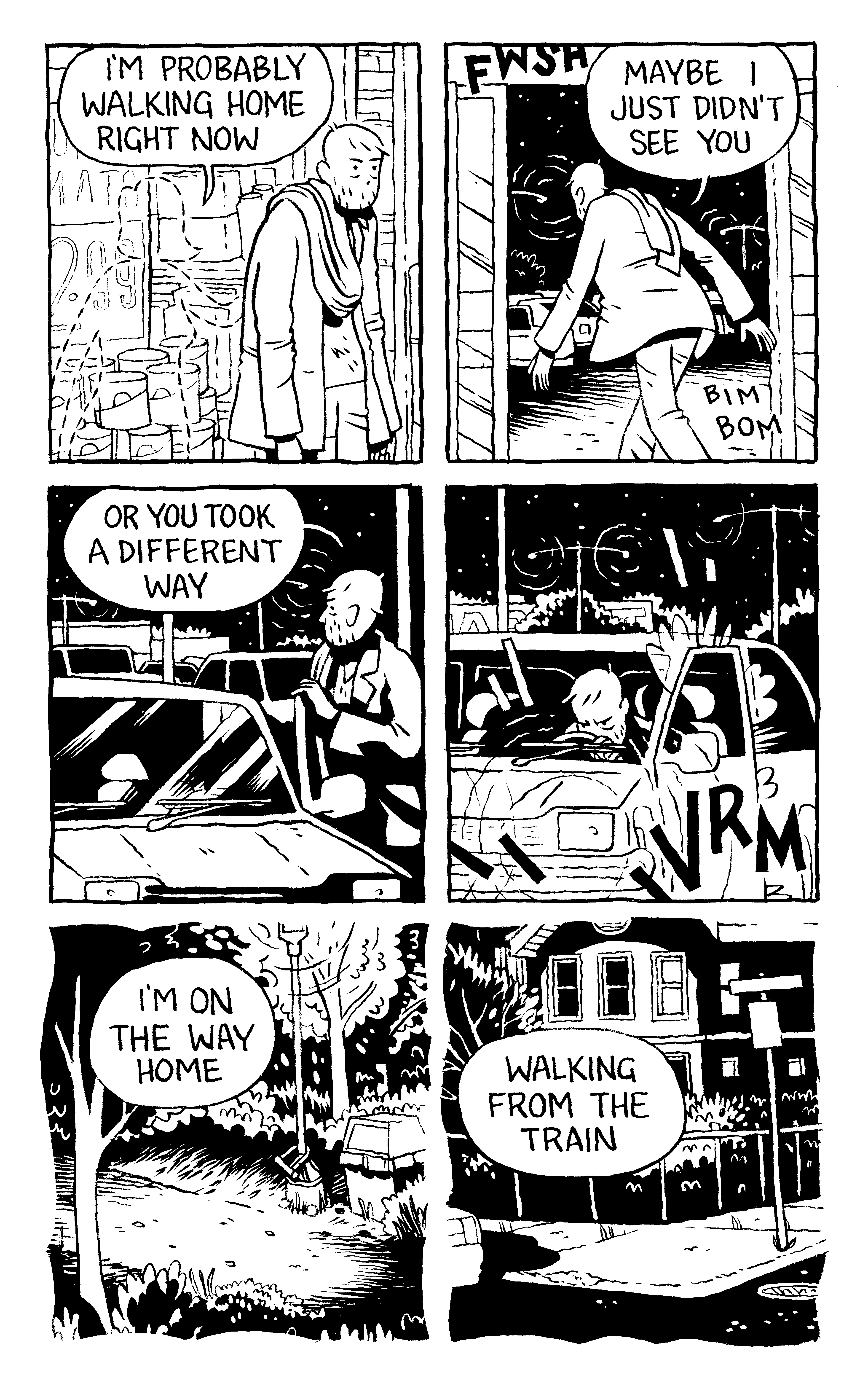
 Since I have you, I have to ask about Uptight and Keeping Two.
Right now I’m pulling 17” x 24” screen prints of every page in the book. 28 prints in all. 30 prints, actually, because I’m doing the missing rainbow page and the cover too. Maybe more if anything else occurs to me. It’s a huge project. So far I’m ten prints into the collection, and they’re coming out really beautifully. As screen prints, I’m able to mix extremely vibrant colors, and the images are really satisfying in the large format. I expect to be done with the whole set in January of 2019, and I’m looking for a gallery to show it at when it’s completed. So, that’s currently taking up all my Thursdays and Fridays.
On Monday, Tuesday, and Wednesday, I’m continuing to work on my graphic novel Keeping Two, which I’ve been drawing, on and off, since 2001. The length of time it’s taken has given me some grief, but I’ve finally gotten comfortable with the idea that it’s just going to take as long as it takes. Currently I’m at page 243, with probably 40 or so pages to go before I’m finished. Until Keeping Two is done, all other comics projects are on hold. I’ve got to get to the end. I’ve finished writing the story, more or less, I have all my thumbnails, and now I am just gluing myself to my drawing table for the duration. I anticipate completing the first draft of Keeping Two in February or March of 2019, then I’ll do the second and third draft, and the book will come out sometime in 2020. After I send that to the printer, I’ll be publishing a collection of short stories and getting back to my work in Uptight.