Stephen Downer: Draws Every Member of the ‘90s JLA

According to Stephen Downer: “So over the last year, I started drawing every member of the ‘90s JLA. I’m a huge fan of Grant Morrison and Howard Porter’s version of the League, and I wanted a project. I’m gonna start posting one of these each day until I run out.”

vk

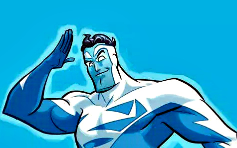
Here we go with Day 1: Electric Superman!


ww

90s JLA, Day 2! Wonder Woman. I really like the way Howard Porter drew Diana during his run. I tried to capture a bit of the feel of his version of the character. I think this is the first proper Wonder Woman I’ve drawn, actually.

b32ats


Batman! ‘90s JLA Day 3. This version of the Batman costume is one I love a lot. Dark blue-gray color scheme, with extra-pointy ears, shoulders and fingertips. Scary, but still more “superhero” than “gritty urban vigilante”.

suoes

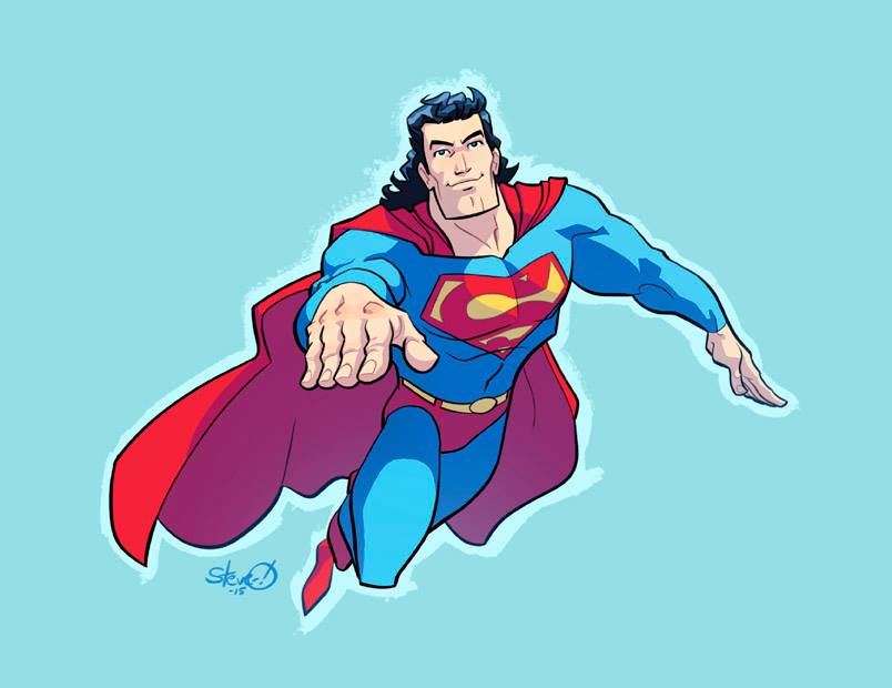
1990′s JLA, Day 4. Superman! Behold the glory of ‘90s Mullet Superman. So beautiful. *sheds tears

gl


’90s JLA, Day 5! The ‘90s versions of these iconic DC superheroes were my first exposure to them in many cases. Kyle Rayner was the first Green Lantern I knew, and I thought he was awesome.

December 19 Update

fll

Day 6: Wally West, The Flash. This guy is in my top three favorite superheroes list, right after Batman and Superman

gaa

1990s JLA, Day 7: Green Arrow! Connor Hawke Green Arrow, specifically. One of those legacy superheroes that was genuinely cooler than the original. (This was when Oliver Queen had, what, one good story to his name?) Oliver Queen got much cooler, but I’ll always like this guy. And dig that Reid Loessbergian jawline!

mmm

Day 8: Martian Manhunter. Not too much to say about this, except that Martian Manhunter is really awesome.

arrr

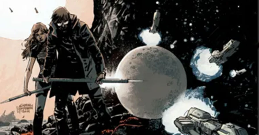
Bearded, harpoon-hand pirate king Aquaman is my absolute favorite version of the character. He seems like an example of the ‘90s “extreme badass” cliche that actually turned out to be great.1990s JLA.

zzzzz

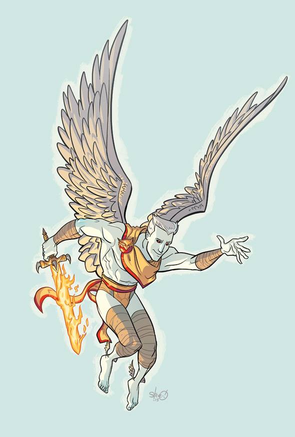
Day 10!: It’s Zauriel! You know, that time a full-on angel started hanging out with the Justice League? I drew the pre-superhero-costume version to start with. I’ll have his full superhero version coming up down the line a bit.

Smash Pages Q&A: Hardman & Bechko on ‘Invisible Republic’

irThis interview, as always with Gabriel Hardman and Corinna Sara Bechko (this time about Invisible Republic) has several gems of insight. In this Hardman notes “I want to point out how lucky we are at this point in time that the comic book industry is a place where we can tell a long form story like Invisible Republic that’s aimed at adults. That’s no small thing.”

Tim O’Shea: First off, how early in the development of the story did you realize that was easiest to mark the passage of time by making Maia’s hair red?

Gabriel Hardman: I’m always looking for simple visual signifiers like that because the content of the story we’re trying to tell is fairly complex. At least it’s heavily serialized and there’s a lot for readers to keep up with. A character having red hair in the past, then gray hair 40 years later, is money in the bank for clarity.

What were the other biggest challenges when denoting the passage of time in this time-sensitive story?

Corinna Sara Bechko: The most apparent challenge is making certain that both time lines look distinct enough for the reader to immediately tell them apart. But there’s another side to this that visuals can’t help with at all. I’m referring to the internal logic of the story, and making certain that both timelines match up when they refer to the same event, or when one event informs another. That’s an aspect that we’ve been meticulous about crafting, even though it gets more complex the further we get into the narrative. I’ve read about authors who devote whole rooms of their house to drawing out timelines on the walls for complicated stories, but I never quite believed it. Well, I’m starting to think we should do the same!

Hardman: Agreed. The relatively simple part is distinguishing the time periods visually. Keeping the content straight is the massive undertaking.

How critical was Jordan Boyd’s coloring in terms of the success of the story?

Bechko: Jordan shoulders a tremendous burden in terms of the storytelling in this book since his colors are the most immediate way that readers can tell the two timelines apart. It was immensely important to us that we work with a colorist who understood this, and who really “got” the mood we were going for.

I cannot praise Dylan Todd’s overall design sense on this book enough. What kind of instructions did Gabriel and Corinna give Dylan?

Hardman: It was actually a very painless process. Dylan had designed the print collection for my solo book KINSKI so when he came onboard for IR, there was already a relationship there. I gave him some references for the kind of thing we were looking for in the design of the supplementary pages and logo and he nailed it with few revisions. I like it what creative work goes easily.

Which supporting characters have exceeded your initial expectations?

Bechko: Definitely Woronov, the female reporter in the present. She wasn’t going to have a large role at first, but she just insisted on it. And Henry’s role has become a lot more important as we’ve scripted the second arc. It’s always interesting when characters go places you don’t expect.

Hardman: Woronov is definitely a favorite character to write. And it will be fun to show that Henry isn’t just Maia’s henchman as we move forward.

With an iconic character like McBride how hard was it write him in a manner that gave him depth versus the caricature of merely a charismatic leader?

Bechko: It’s almost a cliché to say that everyone is the hero of their own story, but Arthur McBride definitely things of himself in that way. As long as we remember that, it’s not hard to make sure that he’s got some dimension to him.

Hardman: Also, we are strictly operating under the idea that characters are defined by their actions. If there are conflicts and contradictions in Arthur’s behavior, that’s how he keeps from becoming a cliché. But at that, Arthur isn’t the main character, Maia is. She’s the one we have to worry about the most.

What was the key to getting the right voice for Croger Babb?

Bechko: I think we’ve all met people like Croger. He means well, most of the time, but he’s a bit myopic about certain subjects. He’s kind of an amalgam of several people, and we try to keep in mind what an actual person in his position would care about and do. He’s not a super hero, he’s just a really stubborn guy with a bit of an overblown sense of his own importance.

Hardman: There is one specific person that Babb is based on but I’m not saying who.

Gabriel, I love your use of white space to let some of the panel layouts breath. Can you share your thoughts on that front.

Hardman: In part, the lack of panel boarders are one of the simple ways we define the pages set in the present. It gives the impression of more white on the page. But more broadly, I tend to use a lot of texture and detail so you need some negative space so the art doesn’t become busy and overwhelming.

Anything we should discuss that I neglected?

Bechko: I want to take a moment to point out the fauna and flora of Avalon. A lot of this will become important later, but so far it’s been a bit in the background. Even so, Gabriel is designing some really cool creatures. We’ll learn a lot more soon about Jo the “dog,” for instance.

Hardman: I want to point out how lucky we are at this point in time that the comic book industry is a place where we can tell a long form story like Invisible Republic that’s aimed at adults. That’s no small thing.

Thanks for giving us this chance to chat about our book, Tim!