A true ‘Hunger Games’ hits comics as chefs compete in a high-stakes competition.
Shutter writer Joe Keatinge and Megagogo creator Wook Jin Clark will spice up the Image Comics line this May with Flavor, the story of a young chef in a closed-off metropolis who enters a high-stakes cooking tournament — and discovers a mystery along the way.
“Flavor is a book with a lot of ingredients; we’re cooking up a comic unlike anything else I’ve collaborated on before,” said Keatinge. “I’ve long desired to work with each and every person on this creative team, and I could not be happier with the results.”
James Asmus, Joseph Keatinge, Christopher Sebela and Joshua Williamson team with artists Joe Infurnari and Jordan Boyd on a story about evolution gone wrong.
Skybound is bringing together six creators — James Asmus, Joseph Keatinge, Christopher Sebela, and Joshua Williamson with artists Joe Infurnari and Jordan Boyd — for their new title, Evolution. Taking place all over the world as humanity starts to rapidly evolve, the series follows three characters who notice the transformation and attempt to fight it.
“For a story as expansive and world-changing as Evolution, we knew we couldn’t tell the story in a normal way so this book includes a murderer’s row of not just one writer, but four writers working together to tell one cohesive story,” said editor Jon Moisan. “This writing team has to be one of the best creative teams ever assembled. Telling the story of a doctor in Philadelphia desperately trying to warn the world, Christopher Sebela has written a frantic race against time. In Rome, James Asmus and Joshua Williamson show us the internal struggle of a nun questioning her faith in the face of the new species. And finally, in Los Angeles, Joseph Keatinge has built a heartrending story of what happens when old relationships are torn to shreds by forces beyond all control. Separately, any one of these stories could anchor their own book but when told together this team has assembled something that has rarely been seen in comics and the results are nothing short of extraordinary.”
New projects from Ales Kot, Joe Casey, Joe Keatinge, Declan Shalvey, Matt Wagner, Jeff Lemire, Phil Hester and more announced at Emerald City Comic Con.
For the past few years Image Comics has held an Image Expo, which is kind of their own mini-convention where they feature creators and make announcements. Since they ended up skipping it this year (it’ll be back in 2018) they used their Thursday panel at the Emerald City Comic Con to unleash a huge slew of comic book announcements.
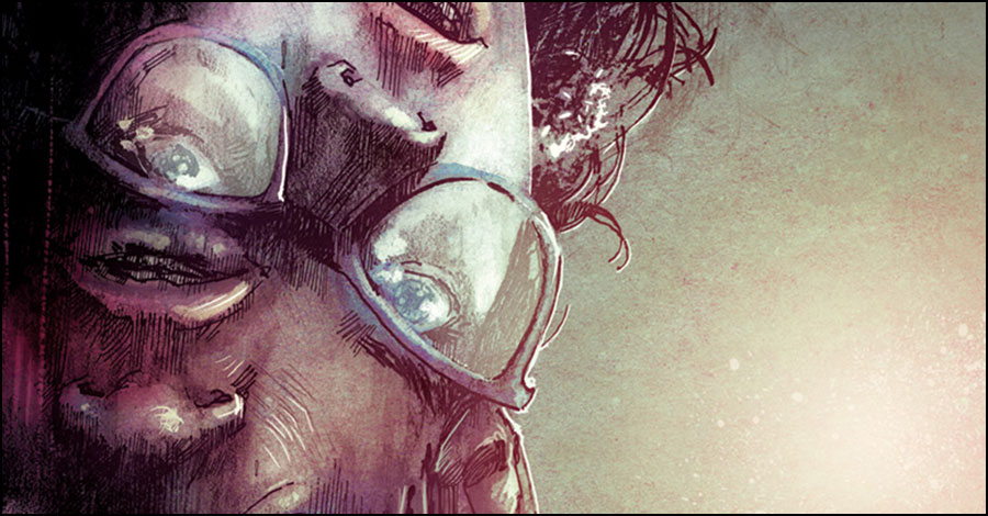
The next Image Comics ongoing series from writer Joe Keatinge (SHUTTER, Adventures of Superman), RINGSIDE, introduces artist and co-creator Nick Barber for an ensemble drama set around the world of professional wrestling. An exclusive teaser trailer featuring all-new material from RINGSIDE #1 will debut in THE WALKING DEAD #147 in stores on October 14th and will outline the new series’ characters and storyline for the very first time. To mark the upcoming release Smash Pages Tim O’Shea spoke with Keatinge, Barber as well as colorist Gough and letterer Maher.
Simon please discuss the muted coloring approach to the series?
Simon Gough: Well, the colouring process is very simple compared to a lot of other work I’ve done, and I’m trying to get that balance of not over rendering like i’m used to, which in turn is letting me play around with the colours a lot more. Its great to get a job where I have time to experiment with the palettes, and put more effort into that side of colouring, as usually its quite technical and can be repetitive. Its hugely important for me to work ‘with’ Nick lines for this book too, and Nick has been nudging me in the right direction, so its been great collaboration as well. The whole team have been working hand in hand throughout to get the pages where we want them.
The issues so far all go through a fairly broad spectrum, where I’m trying my best to give a distinction for each scene.The emphasis on the muted colours will change depending on the mood or action that’s going on, so hopefully you’ll see some noticeable changes in emotion throughout as the story unfolds.
Ariana care to discuss lettering approach?
Ariana Maher: There’s a slightly uneven aspect to the word balloons to reflect the content of both the script and art. A clean, uniform style in the balloons and the text – the sort of style that could work for a different series – would look too sterilized and out-of-place in Ringside’s world. Imperfect works best here. I have to put thought into making mistakes in a mindful way. Though, hopefully, no one will give those details any notice. If readers get drawn into the book without distraction, then I’ll know the lettering works.
I’m looking forward to working on sound effects in Ringside. It’s a bold, harsh world. There are some very loud moments, so accentuating those scenes gives me some very enjoyable challenges to work with. I’ve already had some fun with the very first page of issue #1 because I’m bilingual and the guys didn’t stop me from goofing off with some of the fliers and signs.
What goes into your philosophy for the art Nick?
I’m a fan of high contrast, noir style artwork so that’s definitely the design philosophy I use. On RINGSIDE the art is literally rough around the edges, I’ve been tweaking exactly how rough to go with it – but wanted something that conveyed the tone of the story. Less-is-more is definitely the rule I go by with my stuff – I hate reading comics where the energy has been suffocated by overworked art. But yeah, pretty much my philosophy is how can I tell the story and convey the acting simply and clearly.
Can both of you single out characters that are really growing on you in the creative process?
Nick: All of the characters have become really special to me. Everytime there’s a new script I’m anxious to see what’s happening with each of them. As far as a creative process, I definitely have a sliding scale or how I want a character to look in a certain panel depending on what they’re feeling or conveying. So that’s part of a growth process too – I will push faces into a pretty cartoony area if it feels right, other times maybe go more ‘realistic’ I like having the freedom to do that. Sometimes it’s trial and error of what is more appealing or what might have been too far (either side of the scale). I think playing around with their design like that has made me really fond of the whole cast, I feel like I know their faces, their clothes, their environments etc pretty intimately now that I’m heading towards finishing the first arc of the story.
What are the biggest advantages to publishing with Image?
Nick: I’m new to comics, so Image is the only publisher I’ve worked for so far. In that regard it’s pretty hard to compare it to any other publishers. But one of the things I really like about Image is the freedom you get to create your own book. Our team is small, but we’re all on the same page with the look and feel of this book. There isn’t any meetings going on elsewhere about what should be happening in RINGSIDE – it’s completely up to us. Ownership is obviously a huge advantage – it feels really nice to be creating something with Joe that we own. Another advantage of working with Image is how good everyone there has been on the publisher end of things – a really great team, they’ve helped get the word out about RINGSIDE – obviously first announcing it at Image Expo which led to a lot of excitement. Can both of you single out characters that are really growing on you in the creative process
Joe: It’s a bit of a cheap answer to say, “all of them,” but that’s part of the point of the series. How all these different characters from all these different perspectives and backgrounds interact. What one’s actions has an effect on someone they otherwise never knew. As it builds, it’ll become more evident. What are the biggest advantages to publishing with image
Joe: Everything. There’s no better place to have total control over your own work. No one gives the same level of ownership as they do. Other companies will claim you keep 100% of your copyright, sure, but then they tie you in forever on print rights or digital rights or foreign rights or media rights. There’s always something. And some of those companies do a great job of making sure they earn their cut, but I find that Image just works best for me. If you want total freedom without anyone else, they’re great. If you want the support of a huge team who knows their shit, they’re perfect. I choose for something in the middle, where I regularly talk sales with Corey Murphy, publishing with Eric Stephenson, marketing strategy with Kat Salazar, production with Addison Duke, design with Drew Gill and so on and so on. They have been a major help on every single level. They’re an essential part of the team behind Ringside.
And even still, Nick and I choose everything. Our paper stock. Our pagination. What ads go in the book, if anything. Who represents our media rights, what kind of cut they get, who we bring on for editorial (because I love working with a good, simpatico editor), who does our logo, who colors the book, who letters the book. You don’t get to do that to such a degree anywhere else. Plus it helps their brand is so damn strong right now. My weird world explorer book can thrive in tradepaperbacks. I’m looking forward to what they do with this wrestling ensemble drama. No one’s able to compete on the same level with creator-owned work; the numbers speak for themselves.
Look, I’ve worked with other companies, loved doing it and will likely do it again, but for the type of work I’m doing now, which is largely creator-owned, original series, Image and their subsidiary, Skybound, have been amazing to work with.
Has anyone ever said there was a Tintin quality to your art Nick?
Nick: No! But I’ll take it. Personally I don’t see it, but I love Hergé. The big influences on this book (and my work in general) were Jose Munoz, Hugo Pratt, Eduardo Risso, Gabriel Ba, Taiyou Matsumoto, Rueben Pellejero, Toth… a lot more, just that high contrast school of cartooning. I don’t think I could ever work as cleanly as Hergé! Has anyone ever said there was a Tintin quality to Nick’s art?
Joe: That’s funny, even as big a Hergé fan as I am, I didn’t pick up on it until you mention it, but you’re totally right. I can see it in Nick’s character’s facial expression especially. Interesting call, even if it’s unintentional.
What did both of you most enjoy about that two page spread wrestling scene?
Nick: For me that was just about making a really BIG page turn. The moonsault is a really dramatic move, it sort of slows down time. The opening pages of issue one really ramp up this spread beautifully so I wanted to hit the right note. It places the reader right there at ringside too. It’s a cinematic opening to what is going to be a really epic ongoing series.
What did both of you most enjoy about that two page spread wrestling scene
Joe: I’ve been thinking more and more in how to keep a reader’s attention. There’s more distractions than ever or, at least, more ways for the things in our lives to distract us. With Shutter, I started writing on the Inside Front Cover, so you’re instantly immersed in the comic book. You are in the world without a beat of a credits page or ad to distract you from it. With Ringside, we’re largely a slow burn book, but I wanted to work in something which similarly immersed you in the world, but also gave a rough idea of the different perspectives we’d be seeing it from through the first arc. As readers will see, we have a slow burn, somewhat dense with panels, until a huge kick in the ass of a double page spread, made beautiful by Nick and Simon, with Brandon’s massive logo and Ariana’s design completely selling it.